
Adding Real-Looking Writing to Wall Textures — by doomjedi
Step 1 — Choose your wall texture
Start with a wall texture that is already 64×64 and converted to the Wolf3D palette.
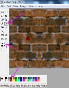
Step 2 — Select your brush
Select a dark red color and use a small or medium brush radius. This keeps the strokes thick enough to read while still leaving enough resolution to form legible letters. Only use the full brush radius in rare cases.
Step 3 — Write the text
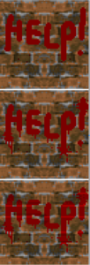
Write the text onto the texture — but not too precisely. A slightly rough, imperfect hand adds realism.
Step 4 — Add drips and splashes
Add vertical paint drippings and "sun-like" paint splashes around the text. Keep these details from obscuring the letters — the text should remain readable.
Step 5 — Adjust shading to match the texture
Change the shades of the text to match the light and dark areas of the underlying texture. For brick walls, this usually just means making the text slightly lighter or darker where it crosses the gaps between bricks.
Keep the shading restrained:
- Use no more than one additional red shade within the same area of the texture.
- For blood specifically, use only two dark red shades — avoid any bright shades entirely.
Step 6 — Done!
That's all there is to it. Simple rules, but following them carefully makes the difference between writing that looks painted on and writing that looks like it truly belongs on the wall.
To return to the GFX tutorials, click here.